Creating an AngularJS reset field directive
Do you know those helpful little X icons that appear in form fields as you're typing? The ones that you click on to clear the entire text entry? I decided to build an AngularJS directive called resetField to do just that, with the additional goal of clearing the underlying ngModel.
If you're eager to grab the code or check out the demo, here you go:
- Code: GitHub repo
- Demo: JSBin demo
Some browsers include this feature out of the box. IE10+ does for text related input elements, and WebKit browsers might add icons for input types of search. You could write a directive that detects the native support and keeps it (by returning and doing nothing), as in the case of IE10+, or opt to apply your directive to all browsers and disable any native functionality. I opted for the latter since it keeps the look and feel consistent across browsers. Either way, you would have to write code to detect the feature, or CSS to disable it.
The following list covers my desired behavior for this feature:
- Limited to input elements with types that make sense to reset (mainly text fields that get no special browser control appearance)
- Limited to elements using
ngModel - Hide the built in clear field icon for IE10+ that's applied to input elements
- Hide the built in WebKit search cancel icon that's applied when
type="search"is used - Icon appears inside the textbox
- Icon visibility is dependent on the input's content (hidden when empty, otherwise visible)
- Icon appears when the input gains focus and it isn't empty
- Icon disappears when the input field loses focus
- Add some CSS3 Animations with
ngAnimate
To get an idea of how this would look I began with an input field, followed by a Font Awesome icon. I added CSS to right-align the icon and gave the field some padding so text wouldn't clash with the icon. Handling the built-in WebKit and IE10+ icons was a matter of disabling the appropriate styles by using the relevant CSS pseudo-classes on our selectors. This CSS covers most of the style related items on my list, except for animations (I'll get to that later).
/* prevent text from appearing underneath the icon */
input[reset-field] {
  padding-right: 19px;
}

/* hide the built-in IE10+ clear field icon */
input[reset-field]::-ms-clear {
  display: none;
}

/* hide cancel icon for search type */
input[reset-field]::-webkit-search-cancel-button {
  -webkit-appearance: none;
}

/* icon styles */
input[reset-field] + .fa {
  position: relative;
  right: 19px;
  color: #C0C0C0;
  cursor: default;
}
<!-- head content -->
<link href="//netdna.bootstrapcdn.com/font-awesome/4.0.3/css/font-awesome.css" rel="stylesheet">

<!-- body content -->
<input type="text" reset-field></input>
<!-- the icon will be added by the directive and is shown here for clarity -->
<i class="fa fa-times-circle"></i>
That should yield something similar to this: 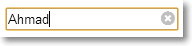
The idea is for an input element to use the reset-field directive, which will add the icon next to the element automatically. Next, I needed a way to toggle the icon's visibility. I also wanted the icon to be clickable to trigger the reset. With these two issues in mind, I added some directives to the icon's markup:
<i ng-show="enabled" ng-mousedown="reset()" class="fa fa-times-circle"></i>
Notice something odd? I'm using ng-mousedown instead of ng-click. The latter worked for me originally, but eventually I added a blur binding on the input element, and that interfered with clicking on the icon (the icon's visibility would be toggled without affecting the content). Since the mousedown event gets fired prior to the blur event, using ng-mousedown resolves the issue.
By updating scope.enabled I can toggle the icon's visibility. The scope.reset() function will handle the reset whenever the icon is clicked. The icon markup uses typical Angular directives, but on its own it's just markup. To get it to function as expected it needs to be compiled and given a scope. To achieve this I use the $compile service, which returns a linker function that takes the scope available from the directive's link function.
To illustrate how this fits into the overall directive, consider the following (incomplete) setup to get a sense of the structure thus far:
angular.module('app').directive('resetField', function($compile) {
  return {
    require: 'ngModel',
    scope: {},
    link: function(scope, element) {
      // compiled reset icon template
      var template = $compile('<i ng-show="enabled" ng-mousedown="reset()" class="fa fa-times-circle"></i>')(scope);
      element.after(template);
    }
  };
});
So far the directive uses an isolated scope and the link function gives us access to the scope and target element. The directive depends on $compile, and is limited to elements with an underlying model since it requires the ngModel controller. The icon markup is compiled with an isolated scope. Next, the compiled template is appended next to the target element.
To limit it to input elements I will test the element's nodeName. To access the element though, I need to access element[0] to get the actual DOM element rather than the wrapped jqLite/Angular version. I also want to limit it to input types that make sense to have this icon applied to (i.e., mainly text related fields, not radio buttons, or date fields that will be rendered differently by browsers). I can achieve this by inspecting the type property of the element's attributes. The link function's third parameter gives me access to the attributes (attrs below).
link: function(scope, element, attrs) {
  // limit to input element of specific types
  var inputTypes = /text|search|tel|url|email|password/i;
  if (el[0].nodeName !== "INPUT")
    throw new Error("resetField is limited to input elements");
  if (!inputTypes.test(attrs.type))
    throw new Error("Invalid input type for resetField: " + attrs.type);
Next, I'll add the logic that determines when to show or hide the icon. I want to show the icon when the element has content. Binding to the element's change event is the easiest way to handle this. Hopefully your app targets modern browsers which support the change event, otherwise you might need to resort to keyup and keydown type of events which can get a little messy when you want to detect changes to handle the delete/backspace/ctrl/shift keys. The change event takes the hassle out of all that and works intuitively.
To check whether the content is empty I could perform standard length checks on the element's value. Instead, I've opted to use the NgModelController.$isEmpty function which performs a few additional checks. I'll be needing the controller anyway for the reset functionality, so it isn't being brought in solely for this purpose. The link function's fourth parameter provides access to the NgModelController.
This gives us the following updated directive:
link: function(scope, element, attrs, ctrl) {
  /* limit to input element... */

  /* compiled reset icon template... */

  element.bind('input', function() {
    scope.enabled = !ctrl.$isEmpty(element.val());
  })
If the element gains or loses focus, I need to update the icon's visibility accordingly. I achieve this by binding to the focus and blur events. Since the focus changes don't affect the content I need force an update by calling $scope.apply(). In fact, Angular does just that under the covers when it handles the input event.
With these concerns in mind, the bindings now resemble the following:
element.bind('input', function() {
  scope.enabled = !ctrl.$isEmpty(element.val());
})
.bind('focus', function() {
  scope.enabled = !ctrl.$isEmpty(element.val());
  scope.$apply();
})
.bind('blur', function() {
  scope.enabled = false;
  scope.$apply();
});
The next piece of the puzzle is implementing the reset() function that gets called whenever the icon is clicked. This is the main part of the code that I changed a few times and wonder if there's a better way to pull off. The main challenge was that resetting the value directly, via element.val(null), wasn't affecting the model. In other words, the binding wouldn't kick in. Instead, I needed to use a pair of NgModelController functions to update the view (and model), then render the changes to the UI. Specifically, the $setViewValue() function updates the view's value (and ultimately the model's value), and the $render() function is responsible for actually updating the view (i.e., the UI gets updated).
After the UI update the focus is lost, so I use the $timeout service to reset it. A piece of advice I received at ng-conf 2014 was that I could get away with setTimeout for better performance since it wouldn't trigger a digest cycle. In other words, $timeout is useful if I have other changes that would benefit from triggering a digest and for testability. The good news is that according to the $timeout documentation I can still use it and avoid a digest by passing in false to the invokeApply parameter.
With these additions the directive resembles the following:
// add $timeout
angular.module('app').directive('resetField', function($compile, $timeout) {
  return {
    require: 'ngModel',
    scope: {},
    link: function(scope, el, attrs, ctrl) {
      /* limit to input element... */

      /* compiled reset icon template... */

      scope.reset = function() {
        ctrl.$setViewValue(null);
        ctrl.$render();
        $timeout(function() {
            el[0].focus();
        }, 0, false);
      };
At this point I've covered everything on my list of requirements and the final item is adding animations. I've decided to leverage the awesome Animate.css library. It provides a number of named CSS3 keyframe animations.
Since the icon uses ng-show, the Angular animation library allows us to plugin to the animation transitions through the ng-hide-* classes that are added when the ng-show value changes. To hook into these I'll add the fadeOut animation (from Animate.css) to the ng-hide-add class, and the 'fadeIn' animation for the ng-hide-remove class. For more details on Angular animations check out "Remastered Animations in AngularJS 1.2.".
A minor issue I ran into with the CSS was that I had to use display:inline to get this to appear smoothly, rather than the display:block suggested by the aforementioned blog post.
To include Animate.css and ngAnimate:
  <link href="//cdnjs.cloudflare.com/ajax/libs/animate.css/2.0/animate.min.css" rel="stylesheet">
  <script src="https://ajax.googleapis.com/ajax/libs/angularjs/1.2.7/angular-animate.min.js"></script>
The CSS needed to work with ngAnimate:
/* animations for ngAnimate */
input[reset-field] + .fa.ng-hide-add {
  display:inline!important;
  -webkit-animation: 0.3s fadeOut;
  -moz-animation: 0.3s fadeOut;
  -ms-animation: 0.3s fadeOut;
  animation: 0.3s fadeOut;
}
input[reset-field] + .fa.ng-hide-remove {
  -webkit-animation: 0.5s fadeIn;
  -moz-animation: 0.5s fadeIn;
  -ms-animation: 0.5s fadeIn;
  animation: 0.5s fadeIn;
}
Next, the ngAnimate module needs to be included:
angular.module('app', ['ngAnimate'])
With these pieces in place the icon now fades in when the input element has text or gains focus (when it's not empty) and fades out when the element becomes empty (while active) or loses focus.
The complete directive looks like this:
angular.module('am.resetField', []).directive('resetField', ['$compile', '$timeout', function($compile, $timeout) {
  return {
    require: 'ngModel',
    scope: {},
    link: function(scope, el, attrs, ctrl) {
      // limit to input element of specific types
      var inputTypes = /text|search|tel|url|email|password/i;
      if (el[0].nodeName !== "INPUT") {
        throw new Error("resetField is limited to input elements");
      }
      if (!inputTypes.test(attrs.type)) {
        throw new Error("Invalid input type for resetField: " + attrs.type);
      }

      // compiled reset icon template
      var template = $compile('<i ng-show="enabled" ng-mousedown="reset()" class="fa fa-times-circle"></i>')(scope);
      el.after(template);

      scope.reset = function() {
        ctrl.$setViewValue(null);
        ctrl.$render();
        $timeout(function() {
            el[0].focus();
        }, 0, false);
      };

      el.bind('input', function() {
        scope.enabled = !ctrl.$isEmpty(el.val());
      })
      .bind('focus', function() {
        scope.enabled = !ctrl.$isEmpty(el.val());
        scope.$apply();
      })
      .bind('blur', function() {
        scope.enabled = false;
        scope.$apply();
      });
    }
  };
}]);
I spoke with Dave Smith at ng-conf 2014. He gave a nice "Deep Dive into Custom Directives" session and kindly accepted to code review my directive to see if I could make improvements. Replacing $timeout with setTimeout was one of those suggestions, which I covered earlier. One of the interesting suggestions he made was to turn this into a component instead, which would allow me to get rid of the $compile step and get rid of the NgModelController calls made in the reset(), perhaps by a direct element.val(null) call instead.
The feedback was much appreciated and I might try my hand at that next. I suppose that approach might allow me to remove the input type checking as well, since the usage of the component leaves no room for ambiguity, or I can still apply the type via attributes.
Be sure to check out my GitHub repo where I have a demo setup of the directive along with a suite of Karma/Jasmine tests.
If you've got any code improvement suggestions, especially around the reset functionality, your feedback is welcome!